matplotlib Part II: Bar Charts and Scatter Charts
Bar Charts
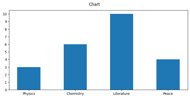
labels = ['Physics', 'Chemistry', 'Literature', 'Peace']
foo_data = [3, 6, 10, 4]

bar_width = .5
xloc = np.array(range(len(labels))) + bar_width
fig = plt.bar(xloc, foo_data, width = bar_width)
plt.xticks(ticks=xloc, labels=labels)
plt.yticks(range(max(foo_data)+1))
plt.suptitle('Chart')
plt.tight_layout()
plt.gcf().set_size_inches((8, 4))
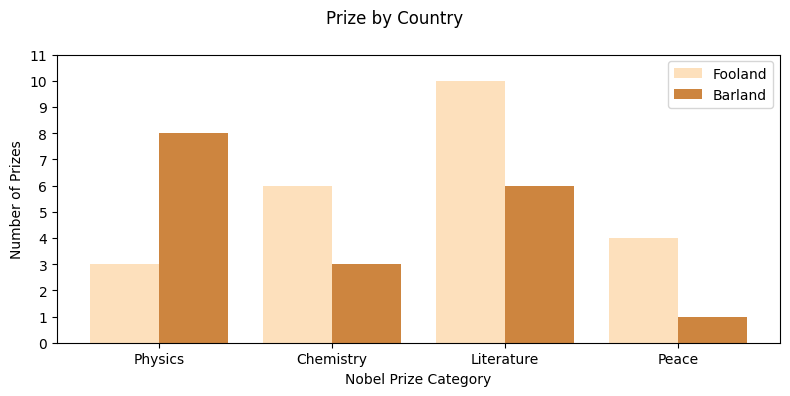
labels = ['Physics', 'Chemistry', 'Literature', 'Peace']
foo_data = [3, 6, 10, 4]
bar_data = [8, 3, 6, 1]

fig, ax = plt.subplots(figsize=(8, 4)) # fig: Figure, ax: Axes or array of Axes
bar_width = .4 # with a width of two-bar groups, this bar width give .1 bar padding
xlocs = np.arange(len(foo_data))
ax.bar(xlocs - bar_width/2, foo_data, bar_width, color='#fde0bc', label='Fooland')
ax.bar(xlocs + bar_width/2, bar_data, bar_width, color='peru', label='Barland')

#--- ticks, labels, grids, and title
ax.set_yticks(range(12))
ax.set_xticks(ticks=range(len(foo_data)),
              labels=labels)
ax.set_xlabel('Nobel Prize Category')
ax.set_ylabel('Number of Prizes')
# ax.yaxis.grid(False)
ax.legend(loc='best')
fig.suptitle('Prize by Country')
fig.tight_layout()
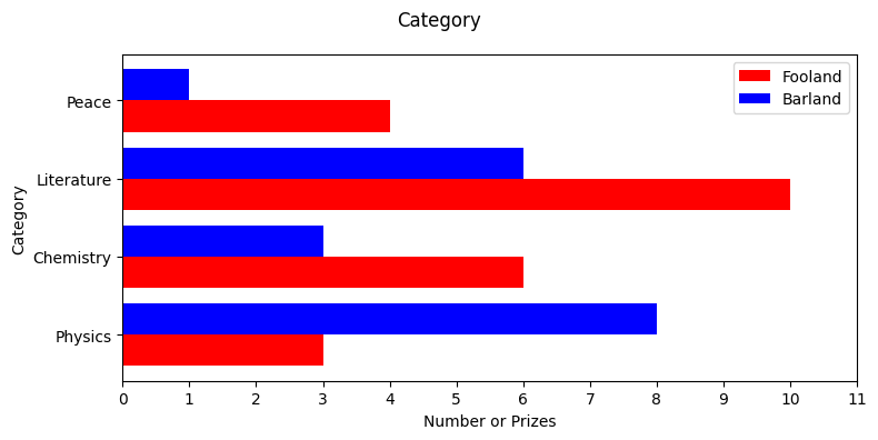
Horizontal Bar Charts
labels = ['Physics', 'Chemistry', 'Literature', 'Peace']
foo_data = [3, 6, 10, 4]
bar_data = [8, 3, 6, 1]

fig, ax = plt.subplots(figsize=(8, 4), tight_layout=True)
bar_width=0.4
xloc = np.arange(len(foo_data))
ax.barh(xloc-bar_width/2, foo_data, bar_width, color='red', label='Fooland')
ax.barh(xloc+bar_width/2, bar_data, bar_width, color='blue', label='Barland')

ax.set_yticks(ticks=range(len(foo_data)), labels=labels)
ax.set_ylabel('Category')
ax.set_xticks(range(12))
ax.set_xlabel('Number or Prizes')
ax.legend()
# ax.set_xticklabels(labels)
fig.suptitle('Category')
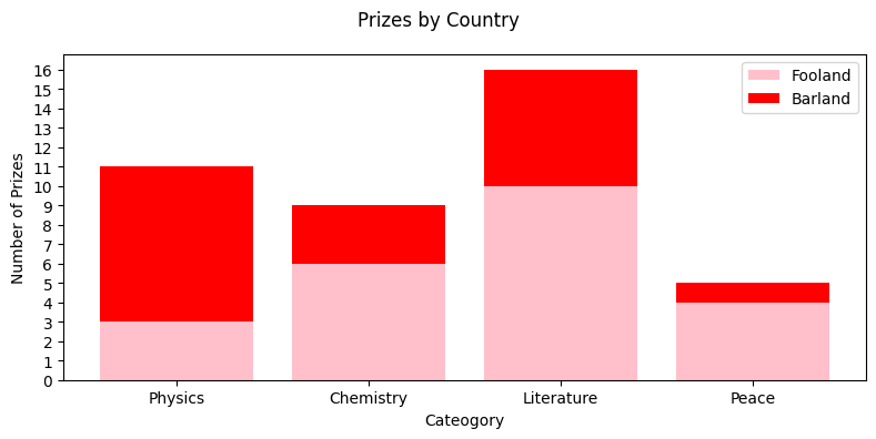
Stacked Bar Charts
labels = ['Physics', 'Chemistry', 'Literature', 'Peace']
foo_data = [3, 6, 10, 4]
bar_data = [8, 3, 6, 1]

fig, ax = plt.subplots(figsize=(8,4), tight_layout=True)
bar_width = .8
xlocs = np.arange(len(foo_data)))
ax.bar(xlocs, foo_data, color='pink', label='Fooland')
ax.bar(xlocs, bar_data, color='red', label='Barland', bottom = foo_data) # bottom keyword

ax.set_xticks(ticks=xlocs, labels=labels)
ax.set_xlabel('Cateogory')
ax.set_yticks(range(max(np.array(foo_data)+ np.array(bar_data))+1))
ax.set_ylabel('Number of Prizes')
ax.legend(loc='best')
fig.suptitle('Prizes by Country')
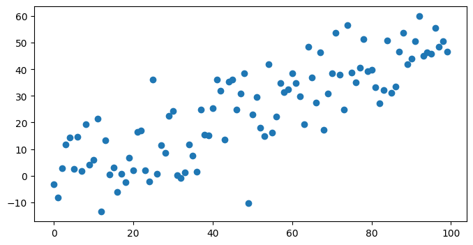
Scatter Plot
num_points = 100
gradient = .5
x = np.array(range(num_points))
y = np.random.randn(num_points) * 10 + x*gradient
fig, ax = plt.subplots(figsize=(8,4))
ax.scatter(x, y)
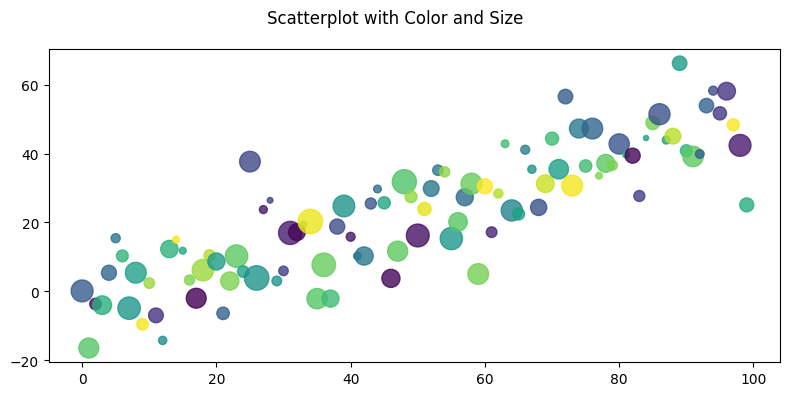
Scatter Plot with Different Color and Size
num_points = 100
gradient = .5
x = np.array(range(num_points))
y = np.random.randn(num_points) * 10 + x*gradient
fig, ax = plt.subplots(figsize=(8,4), tight_layout=True)
colors = np.random.rand(num_points)
size = np.pi * (2 + np.random.rand(num_points) * 8) ** 2
ax.scatter(x, y, s=size, c=colors, alpha=.8)
fig.suptitle('Scatterplot with Color and Size')
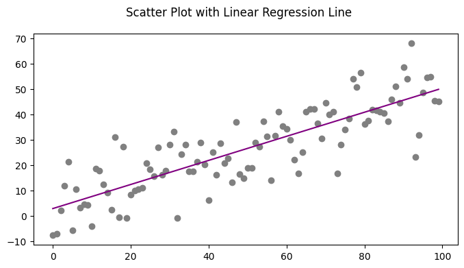
Scatter Plot with Linear Regression
num_points = 100
gradient = .5
x = np.array(range(num_points))
y = np.random.randn(num_points) * 10 + x*gradient
fig, ax = plt.subplots(figsize=(8,4))
ax.scatter(x, y, c='grey')
m, c = np.polyfit(x, y, 1) # first-degree(linear) regression
ax.plot(x, m*x+c, color='purple')
fig.suptitle('Scatter Plot with Linear Regression Line')