matplotlib Part I: Basics
Manipulating matplotlib
import matplotlib as mpl
mpl.rcParams['lines.linewidth'] = 3
mpl.rcParams['lines.color'] = 'g' # green
Installing Font to matplotlib
from matplotlib import font_manager, rc

# linking the font directory to font_manager class
font_dirs = ['/home/jovyan/nanum']
font_files = font_manager.findSystemFonts(fontpaths=font_dirs)

for font in font_files:
  font_manager.addfont(font)

# check if the font is installed
[f.name for f in font_manager.fontManager.ttflist]
# reconfiguring the font parameter
rc('font', family='NanumSquare')
Configuration
import matplotlib as mpl
# rc as in Run at startup and Configure
mpl.rcParams['lines.linewidth'] = 2
mpl.rcParams['lines.color'] = 'g'
mpl.rcParams['lines.linestyle'] = '--'

# or
from matplotlib import rc
rc('lines', lw=2, c='r', ls='--')
pyplot
import numpy as np
import pandas as pd
import matplotlib.pyplot as plt
from datetime import datetime

# create pandas datetime Series with 200-day element(d) starting fro datetime.now()
x = pd.period_range(date.now(), periods=200, freq='d')
# x is pandas PeriodIndex
x = x.to_timestamp() # converts datetime index to pandas DatetimeIndex
y = np.random.randn(200, 3).cunsum(0) # create 200x3 random normal distribution float array and cumsum along 0 axis
plt.plot(x, y)

legend
plots = plt.plot(x, y[:,0],'-', x, y[:,1],'--', x,y[:,2],'-.')
plt.legend(plots, ('foo', 'bar', 'baz'), loc='best', framealpha=0.5, prop={'size':'small', 'family':'monospace'})
# ('foo', 'bar', 'baz') tuple is taken as `handles` argument to be labeled on the legend
# loc is location (default best)
# framealpha to configure transparency of legend

Titles and Axes Labels
plots = plt.plot(x, y[:, 0], '-', x, y[:, 1], '--', x, y[:, 2], '-.')
plt.legend(plots, ('foo', 'bar', 'baz'), loc='best', framealpha=.5, prop={'size': 'small', 'family': 'monospace'})
plt.title('Random Trends')
plt.xlabel('Date')
plt.ylabel('Cumulative Sum')
# figtext adds text to the figure
plt.figtext(.995, .01, '© Acme Designs 2022', ha='right', va='bottom')

Customized Line Chart
Plot insert with figure.add_axes
from datetime import datetime
import pandas as pd
import matplotlib as mpl

x = pd.period_range(datetime.now(), periods=200, freq='d')
x = x.to_timestamp()
y = np.random.randn(200, 3).cumsum(0)

fig = plt.figure(figsize=(8,4))
# Main Axes
ax = fig.add_axes(rect=(.1, .1, .8, .8)) # rect=(left, bottom, width, height)
ax.set_title('Main Axes with Insert Child Axes')
ax.plot(x, y[:,0])
ax.set_xlabel('Date')
ax.set_ylabel('Cumulative Sum')

# Inserted Axes
ax = fig.add_axes(rect=(.15, .15, .3, .3))
ax.plot(x, y[:, 1], color='g')
ax.set_xticks([])
ax.set_yticks([])

plots = plt.plot(x, y[:, 0], '-', x, y[:, 1], '--', x, y[:, 2], '-.')
plt.legend(plots, ('foo', 'bar', 'baz'), loc='best', framealpha=.5, prop={'size': 'small', 'family': 'monospace'})
# change size of the figure
plt.gcf().set_size_inches(8, 4)
plt.title('Random Trends')
plt.xlabel('Date')
plt.ylabel('Cumulative Sum')
plt.figtext(.995, .01, '© Acme Designs 2022', ha='right', va='bottom')
# truncate layout to improve readability
plt.tight_layout()
# save as
plt.savefig('save.png', dpi=200)

plots = plt.plot(x, y[:, 0], '-', x, y[:, 1], '--', x, y[:, 2], '-.')
plt.legend(plots, ('foo', 'bar', 'baz'), loc='best', framealpha=.5, prop={'size': 'small', 'family': 'monospace'})
plt.gcf().set_size_inches(8, 4)
plt.title('Random Trends')
plt.xlabel('Date')
plt.ylabel('Cumulative Sum')
# put grid
plt.grid(True)
plt.figtext(.995, .01, '© Acme Designs 2022', ha='right', va='bottom')
plt.tight_layout()
plt.savefig('save.png', dpi=200)

Object-oriented matplotlib
# create and configure a figure
fig = plt.figure(
figsize=(8, 4),
dpi=200,
tight_layout=True,
facecolor='yellow',
linewidth=10, edgecolor='green'
)
plots = plt.plot(x, y[:, 0], '-', x, y[:, 1], '--', x, y[:, 2], '-.')[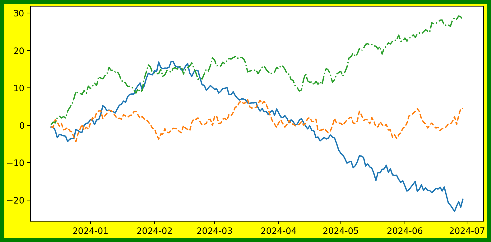](http://blog.bronzevirus.com/uploads/images/gallery/2023-12/7aDka976Of93TXD1-fig.png)

Axes and Subplots
# fig = Figure, ax = Axes or array of Axes
fig, ax = plt.subplots()
plots = ax.plot(x, y, label='')
ax.legend(plots, ('foo', 'bar', 'baz'), loc='best', framealpha=.25,
                  prop={'size':'small', 'family':'monospace'})
ax.set_title('Random Trends')
ax.set_xlabel('Date')
ax.set_ylabel('Cumulative Sum')
ax.grid(True)
fig.set_size_inches(8, 4)
fig.text(.995, .01, '© Acme Design 2023', ha='right', va='bottom')
fig.tight_layout()

fig, axes = plt.subplots(
                      nrows=3, ncols=1, # specifying subplot grid rows and cols
                      sharex=False, sharey=True,
                      figsize=(8, 12))
fig.suptitle('Three Random Trends', fontsize=16)
fig.tight_layout()
labelled_data = zip(y.transpose(),
                   ('foo', 'bar', 'baz'), ('b', 'orange', 'g')
for i, ld in enumerate(labelled_data):
  ax = axes[i]
  ax.plot(x, ld[0], label=ld[1], color=ld[2])
  ax.set_ylabel('Cumulative Sum')
  ax.legend(loc='upper left', framealpha=.5,
            prop={'size': 'small'})
ax[-1].set_xlabel('Date') # only label as 'Date' on the last x-axis

Reference
matplotlib reference
matplotlib configuration
customizing matplotlib